Modernism entailed the reconfiguration of elements through the introduction of the grid in collaboration with an obtained sense of spacial awareness.
This impacted not only on illustrative and compositional design works, but also upon a shared attitude towards type, ultimately resulting in it to become far less decorative. Through the modernist era, experimentation with sans-serif and monotone block print can be strictly recognised, inspired by the up and coming Swiss style.
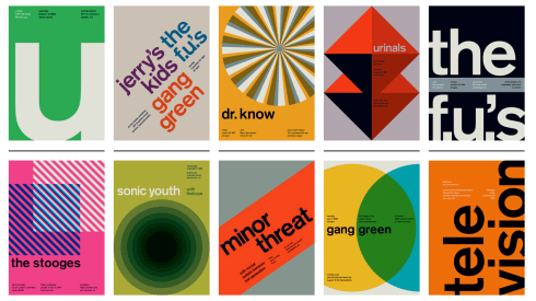
Images embedded above document examples of Swiss style posters, also known as the International Typographic style.
These creative works presented an unconventional twist upon the art of design, utilising simplicity and minimalism to reduce components down to their most legible, yet aesthetically pleasing form. Colour, composition, alignment, stylisation, readability, and audience interpretation played a key role in the production of such visuals, which served as a direct and inspiration point of reference across all design disciplines.
Typography served as one of these design areas, where process was reconsidered, and the grid system was introduced more heavily when composing such assets. Such principles are prominent through even recent graphic design, proving the Swiss style to be a heavily inspirational and a revolutionary movement.
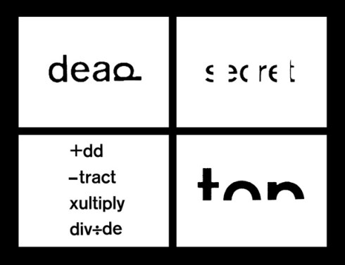
Robert Brown John created the above typographic outcomes with direct reference to the Swiss style and principles demonstrated within it. However, despite a previous trend of digitalisation, sharpness and the use of new technology, Robert Brown John displayed works that used hand-made kinetic energy, with combined modernist stylisation. This sparked inspiration through graphic design, providing refined structure in an imperfect, raw and personal approach. The effect of ink/ press directly to paper provides an organic attribute, beyond the possibilities of achievement in the digital word. This is then scanned and digitally manipulated to strengthen qualities and the overall visual image.

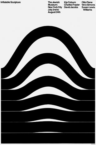
Arnold Saks – Inflatable Sculpture, 1969
Inflatable Sculpture by Arnold Saks portrays a rational recognition of the minimalist movement brought by the Swiss style. It refines shape, colour and type to the simplest form, inducing a bold visual outcome, while avoiding over-complication of the page as a spread or composition.
The nature of this design echoes the idea that “less is more”, proving that minimalism can often be more effective and eye-catching than complicated, intricate design.


Jessica Svendsen’s designs for MIT Technology Review through 2016 recognise key principles reminiscent of the modernist movement. Her playful approaches echo such experimentation playing with use of the famous grid, yet still abiding by it to ensure the design works on the page and is presented to be aesthetically pleasing. Her colour scheme is muted, featuring just one colour amongst a grayscale, monochromatic theme. This heightens impact and enforces collaboration, presenting an association between covers.
Reflecting upon this lecture, I have gained an obtained knowledge of the origins of the famous dada movement, constructivism, futurism, bauhaus and cubism. Each of these movements play with abstract and form, experimenting with rules and restrictions. This is predominantly a response to their place in history, where design served as a method of self-expression and public enlightenment within a society which was otherwise unstructured and run down. Design resolved from a shared sense of discomfort, given redirection through the mentalities of inspirational designers and artists. Creative outcomes were inspired by sensory qualities, such as emotive as mentioned above.
