This blog is selected as 2/3 for summative assessment. Please note: This blog refers to the second week of a three week workshop. Week 1 and 3 can be easily accessed from the links below.
[Nadine] Week 1
[Nadine] Week 3
Week 2 of this Short and Tweet project entails for the investigation and finalisation of key assets relevant to the project, including the editorial and layout design of the spreads, as well as the typographic content for use throughout the outcome.
Typographic Research:

This is a mood-board I created to inspire potential typographic direction within this project. A correlation can be noticed across those of which I selected, where bright colours and ‘fun’ stylistic nature draws each of these visuals together.
Considering that the final Short and Tweet booklet will be predominantly typographic, it seemed necessary to consider using more intricate, interesting and bright styles. This would keep the spreads looking lively, while attracting and maintaining viewer attention.
The link for the Pinterest board is as follows: https://www.pinterest.co.uk/itskxtie/short-and-tweet-typography/
Typographic Experimentation:

To create this, I used the Funkydori typeface, found on Adobe Fonts. A screen shot documented below displays where I found this.


To create this font style, I edited the original type outline to make the word one connected line. I converted the text into an outline using Adobe Illustrator, which allowed me to alter and change the anchor points of the type path. Upon completion of this, I switched back from outline view to preview mode, where I removed fill and applied a stroke to the text. This was how I created the font variation as seen above.
The general idea, was to reflect the nature and meaning of my chosen word, ‘mindfulness’, constructing one smooth, steady and progressive typographic edit.
Inspired by Veronica Kraus’s ‘make’, documented in the first image below, I investigated how I could stylise my font using similar editorial techniques. These playful investigations are documented below.
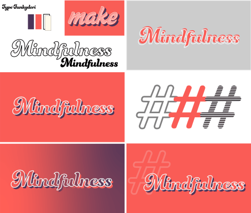
Upon reflection of my typographic manipulation and stylisation, I am pleased with the overall effect. The smooth flow of the typeface reflects progression, while also obtaining a relaxed visual melody, comparable to the connotations of ‘mindfulness’ as a concept. Additionally, the typography is clean-cut; edges are refined and smoothed off, providing aesthetic harmony throughout both the visual, as well as the meaning it reflects.
The block shadow provides emphasis on the word, enhancing its prominence, while the stark white outline provides a distinct boundary between type and background. These combined entail for a bold overall effect, even considering the predominant type colour being shared with the background colour; this makes the text and the background appear as a collaborated visual, as opposed to two separate assets.
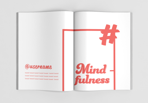
With specific regard to colour usage, I constructed a colour palette for use through my project. This ensures that all colours and tones will be maintained consistently throughout the spreads.
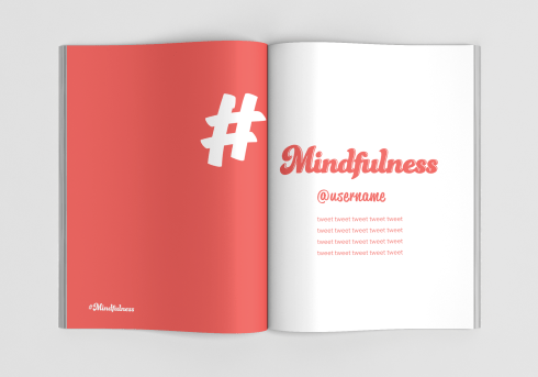
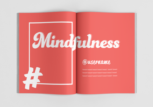
Currently, the red tone (#f15d59) is intended as a predominant colour, as I like how this translates on the page and provides subtle contrast with white/off-white tones. With prominent brightness yet reduced vibrancy, the colour displays considerable balance in intensity and saturation. A visually enticing colour, use of such in print and across spreads provides a naturally occurring factor of desirability, where the viewer/ audience would effortlessly become intwined with the graphic, interpreting all aspects of the visual. This is especially due to the fact that the colour is vibrant enough to ‘pop’, while also being subtle enough to induce harmonic flow throughout the piece.
Colour palette displayed below:

Edit: Later, I decided that the purple tone was too heavy on the spreads, and created too much tonal differentiation which ultimately underwhelmed the red tone. I removed this and worked with a simplified two colour document.
InDesign Set-up:
Next, I set up my booklet on Adobe InDesign. Individual masters were created for each different spread, before being assigned to specific pages of the book. This saves time and assures for accurate consistency across pages, an example of an automated design feature offered through the software.
Additionally, the use of multiple masters induces pace, where the general composition can be easily differentiated. In essence, grids, guides and columns can be applied differently through masters, providing new potentials and greater opportunities. Switching up the layout keeps the audience/ reader interested, preventing the risk of boredom induced by repetition.


Character & Paragraph Styles:
In addition to the master pages, I also set up character and paragraph styles for each typographic asset. This provides automation to ensure each component is kept consistent. Individual character styles were created for each text component, to keep the colour/ sizing as intended. Paragraph styles were then created for each type of text, i.e. ‘Username’ and ‘Tweet’. This ensures that any stylisation on the paragraph as a whole is consistently applied, such as tracking and leading. This also means that changes can be made from these styles, without having to change individual pieces of text, ultimately saving time.


Mock-Up
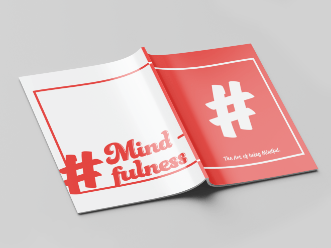
As a final and additional step to this workshop, I applied my spread designs to a mockup so that I could envision what the design would look like in print.