(Editorial and Layout)
Project Launch:
The Brief: To produce a predominantly type-based booklet, constructed of tweets, centred around a hashtag of personal interest.
The purpose: To utilise and improve editorial skills, with direct association to typography.
Requirements: The booklet must contain three distinctive spread designs and include a minimum of 45 tweets, embedded through the use of software automation, (InDesign’s DataMerge tool).
#
Mindfulness: This is the hashtag I selected for investigation, specifically considering the recent Covid-19 circumstances, and the effects it has caused globally, specifically upon mental health. Selected messages/ tweets will be diversely targeted and therefore be relevant amongst a majority of society, despite each of our individual thought processes and methods of emotive process.
Providing relevance inflicts appeal for any outsider to the project, hopefully drawing them in and creating an urge for them to want to read the book. Additionally, the process of collaborating stranger’s messages taken from their Twitter platforms strengthens my initial message, immediately portraying a sense of community with the idea that we, as a human race, exist as one, and we are fighting our thoughts and emotions together.
Data Collection: Documented below are a few examples of #Mindfulness tweets that particularly caught my attention. I saved each of these for use in my booklet.


Editorial Design
Secondary Research:


A mood-board constructed on Pinterest, inspiring stylistic choices when considering the editorial/ layout design of my spreads.
Specifically, colour was a key aspect of focus, where I almost immediately realised that those with a pop of vibrancy, stood out the most, especially attracting the viewers attention.
Additionally, the multi-layered approach initiated a sense of depth, creating the general perception of a foreground/ background. This can be effective when trying to create visual hierarchy, making certain components stand out above others, while improving the overall visual/ aesthetic.
Primary Research:


I took these typographic references from the book ‘I used to be a design student’ by Frank Philippin and Billy Kiosoglou, produced by Laurence King Publishing. Studying these, amongst other layouts seen within the book, provided a different dynamic, revealing a true rawness in form. This allowed for exploration of the effect of differentiated layout as intended for purpose.
Viewing the visuals in print made me notice the importance of typographic stylisation, as well as the distribution of white space and general use of composition. Application of the grid can be clearly noticed, entailing for considerable organisation. This makes the design look neater and generally more aesthetic, while considering visual hierarchy and legibility factors.
Layout Concepts:

Next, I drafted some thumbnail sketches to envision how my final spread outcome could potentially look. This allowed me to document my current ideas and visualise how the spreads could come together as booklet outcome. Varying the document proportions entailed for greater scope of creative innovation to be encouraged, where less conventional document sizes are now considerable as potentials in my project. For instance, I particularly like the simplicity of layout 4.
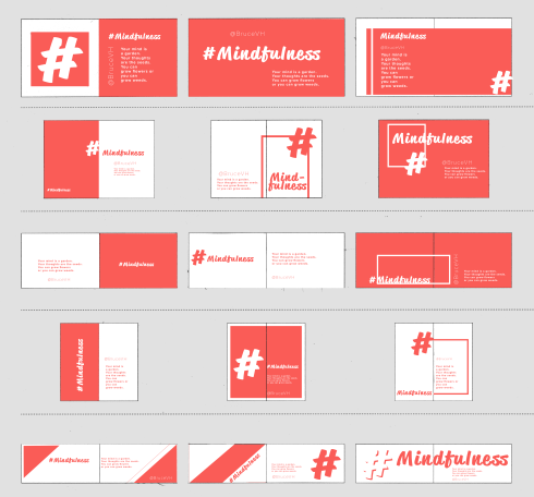
Further exploration came in this next stage, where I decided to quickly digitalise and mock-up each of my sketches. This allowed me to visualise how the spreads would look more clearly, ensuring the correct overall decision is adhered too. Purpose, readability, and how the book would feel in the readers hands are each factors of consideration here.
Review:
On review of my digitalised thumbnail sketches, qualities apparent within the second and fourth spreads particularly made these favourable options. Upon asking for feedback from peers, friends and family, it was agreed that these two are the strongest compositionally, and withhold most potential for use as booklet spreads.
My decision finally was made when I considered printing factors. The second composition is a more common size, being a default pre-set amongst paper size and printer options. Additionally, this composition size entailed for greater potentials with organisation of negative space the creation of pace through compositional aspects, creating a visually breathable aesthetic, while implementing and exaggerating contextual prominence. Ultimately, this compositional layout will benefit the typographic content, allowing it to stand out amongst my pages, as intended to suit my booklet’s purpose.
The size would also have a nice feel when being physically held and read by an audience/ viewer, allowing for page turn-overs to be managed with ease and speed. This is especially important since tweets are limited to 280 characters, meaning that each page will not have massive amounts of typographic content.

One thought on “[Nadine] Week 1”