
This blog is selected as 3/3 for summative assessment.

Part 1: Essentials Advanced.
Project Initialisation:
Always gather inspiration. Good Reference sites –
Layout inspiration:
– Designspiration
– Behance
– From Up North
– Pinterest
Font:
– Font Squirrel
– Font Pair
– Creative Bloq
Key fact: ‘Font’ refers to the family, eg ‘bold/ italic’, while ‘Typeface’ relates to the group, eg ‘Helvetica’.
Gathering references/ inspiration for any specific publication aids the process of layout and editorial design, fuelling creativity with regards to graphic innovation and potential.
Start every design by composing a suitable grid; Not only will this help the design look cleaner and neater, but it also makes that initial ‘white page’ look less intimidating, providing many creative layout potentials and ideas.
This grid can be composed differently throughout master pages, allowing for alternate layouts to be created throughout spreads/ across a book or publication. This creates pace, a term used to reflect progression and variation to maintain interest from a reader/ audience.
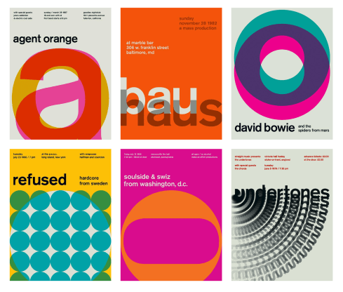
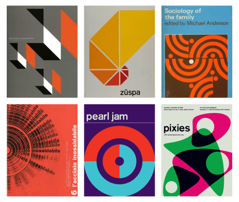
Pace can also be obtained through not only the use of alternate layouts, but also through typographic illustration, text warps, shape and patterns, use of varied backgrounds, image crops, and typographic interaction with photographic content. These are just a few examples, where successful use of such increases visual appeal.


Images above provide examples of spread designs that contain ‘pace’. This can be noticed in their playful layout variations; each spread contains a different use of available space, keeping the flow interesting for a reader. Additionally, the use of varied grids can be noticed amongst the spreads selected and documented above, providing a similar lucid feel to the designs as a collective, translating a more fun and less expected nature for a viewer.
Despite these variations and differences, key aspects have been maintained throughout the documents, such as colour scheme, and typographic stylisation. If these are edited, they are done so with purpose. Making too many changes to stylistic assets of spreads increases the risk that they will not appear to exist as the same collective outcome. This is important to translate brand identity and general nature, providing the reader with some form of memorable visual.
In practice, we had a quick recap of how to use some of InDesigns more advanced features.


Multiple Master Pages
These screenshots display how multiple masters can be set up and applied to different pages throughout the spreads of the document. The use of these allows for different compositional variations to be utilised and adapted throughout the course of the publication/ print outcome. As noticeable in the above screenshots, different grids were set up per master, increasing layout potentials, and therefore, implementing the potential of creating pace.


Page Numbers
These screenshots present an ability of creating page numbers throughout the document, which can be adapted to start at any given page as intended.
The page numbers are initially embedded into the original master pages, through the use of inserting a ‘special character’. This automatically provides the page number when this master is applied through the pages of the document.
When selecting the page at which you intend for the numbering to start, right click and access the ‘numbering and section options’ menu, which allows a value to be input, denoting at which point in the document this specific page will count onwards from.
Drop Caps and Dynamic Spelling


These screen clippings display how a ‘drop cap’ can be created. This menu can be accessed by selecting the three little lines in the top right hand corner of the document, and clicking on the subheading that reads ‘ Drop Caps and Nested Styles’. You can then input the amount of lines you wish for the initial opening letter of the paragraph to drop down by. For instance, in the above screenshot, I input a value of 4, which caused the letter to meet the size requirements of the spacial region of four lines of text.
Also, this screenshot displays dynamic spelling being turned on. This can be accessed through the menu ‘edit – spelling – dynamic spelling’. This means that spelling errors are brought to attention initially, where the word will form a red underline if it has a mistake, alerting for change immediately. This ensures that the document is produced to a level of professionalism, especially important if produced for intended commercial use.
This leads on to the second part of this workshop session, where we were set design tasls/ challenges, allowing us to put our skills and learned tools/ techniques with the InDesign software to practice.
Tasks –
Initial Research: Barbara Hepworth –
As encouraged and recommended, the first thing I did before attempting these tasks was gather research and initial references to inspire project direction.
This video is a reference source, provided to reflect an insight of Barbara Hepworth’s character, transcribed directly from the letters Hepworth wrote herself.
Her influences resolve around her personal surrounds, including countryside and sea, the movement of seasons through time, day and night, and changes of light. She became completely immersed in her environment, providing a sense of creative energy. For this reason, Hepworth’s sculptures exist as unnatural, manmade elements of nature.
She was fascinated specifically with the framing of a scene through her sculptures which correctively feature holes. Hepworth specifically said she aimed to capture a ‘physical sensation of piercing’, navigating viewers attention towards the hole.
Her sculptures exist in close relation to her own thoughts and feelings, where she says “I will continue to exist as a pagan trying outwardly to behave myself”. This later correlates with another statement she made about her sculptures, suggesting that many have experienced a sense of ‘sensuality’ contained within, despite the sculptures having conventionally smooth and disciplined exteriors and edges.
Visually enticing, her sculptures were designed to draw in audience attention with integrity, “all want to touch, that is as it should be.”
This video informs a bold ideology, where her sculptures were created with purpose – to be seen, interacted with, and felt. They were created as emotive self-expressions, driven by her environmental and natural inspirations. Circular holes were often featured, to draw in an audience and refocus/ redefine their perspective.
Barbara Hepworth withholds very prominent stance within the sculpture industry, where she proposed a whole new form of sculpting that was completely unseen before, combining creative innovation with physical form.
Hepworth’s main stylistic stance stemmed from the idea of creating of space inside a sculptured object, as opposed to sculpting the object’s exterior. This related directly with her intent to provide insight, allowing the audience to envision themselves in her headspace at the time of creation, which was flooded with inspiration from natural scenes and landscapes. For this reason, her sculptures can be recognised as being inviting, leading the viewer on an unconventional, visually intriguing and subconscious journey into her sculptured progress and motives of intended translation.
Her main working material was wood, which she calved appropriately to accentuate its original form and highlight its material properties. She calved into it and explored the space at which existed inside. Each of her different sculptures existed as a visual documentation exploration of how she investigated the potentials of opening the shape up. In doing so, her sculptures also investigated the natural fall of light, and how this would project inside the interior spaces she created.
In the 1970’s she made the decision to start working in bronze, reducing fragility and improving durability. This informed new stylistic potentials, where Hepworth adapted a new visual language. The use of bronze allowed her to create sculptures of more skeletal form- thinner, broader and more ‘gestural’ overall.


Documented above are some examples of Hepworth’s sculpture works. A correlated sense of intricacy can be noticed, where each of her sculptures feature a playful sense of spacial investigation. A subconscious sense of nostalgia can be felt, due to an initiated and intentional link she has made between her calved out forms and the nature she was inspired by.
Task 1 – Barbara Hepworth – Swiss Style Poster
This first task involves the creation of a Swiss style poster utilising our Adobe InDesign skills and techniques learnt through these two digital workshops.
Visual References:
These images were selected as reference imagery, inspiring the process of deliberate simplification. One key area of consideration is spacial usage; this needs to be carefully considered to suit the intended minimal nature of the design, and so a sustained layout stylisation must consist through the poster outcome. As seen in the examples above, the main graphic components become immersed with the background, and often interacts with the typographic elements.
One collective feature seen throughout the outcomes above is the usage of sans serif fonts, frequently Helvetica or Futura. These suit the bold and simplistic visual nature of Swiss style, meaning that they work effectively for use on posters.
Creative Progression:


Here, I studied one of Hepworth’s more iconic sculptures, familiarising myself specifically with its shape and form. I then vectorised this in Adobe Illustrator, simplifying depth to create instead, a flat, yet recognisable solid. The intention here, was for this graphic component to used in my final poster, providing a direct link to Barbara Hepworth.
The final poster outcome; I utilised my vector shape to create a sweeping dynamic across the page, achieved through reframing visual perspective. I believe this stylisation echoes the nature of Hepworth’s sculptured intentions and transcribed motives, using her directional line technique to guide the viewers eye throughout the poster.
Typographic stylisation and placement was strictly considered throughout this design, consistent with the use of type-face, yet alternating the font family throughout, dependent upon the hierarchy of the information. Varied sizes were used to implement the same effect.

As seen in the image above, I used a grid through my working document, entailing for a sense of spacial awarenesses throughout the poster. This allowed me to organise content to fit within structured guidelines, making the final outcome appear neater and more organised, immediately improving the legibility factor.
Task 2 – Barbara Hepworth – A4 Magazine Spread
Visual References –


Imagery above was gathered to inspire my layout and editorial design of my spread. In particular, I like the unconventional image clipping, and the way in which all elements of the spread come together to complete the design.

The final outcome of this second task; here I constructed an A4 magazine spread to promote Barbara Hepworth as an artist.
Stylistic choices were made and applied to ensure that the layout suited Hepworth’s style and inferred nature. To achieve this, I utilised a composition contained within one of her sculptures itself as a second background grid. I extracted shapes from this composition and outlined these with the pen tool. I then assigned that clipping path to a ‘Graphic’ frame in the content options, allowing me to embed an image as usual.

As seen in the screen shot above, a knowledge of grid and composition was applied to the layout and editorial design, considered when making stylistic choices.
A colour scheme was selected based upon the colour content of the embedded image, ensuring for consistency to exist across the spread and improve the overall aesthetic qualities. In addition to this, I also selected the green pigment for feature based upon connotative qualities and the nature of which is inferable. Hepworth was inspired by nature and landscapes, and so this was also considered when making this decision. A detailed colour palette overview is embedded below.
A feathered gradient effect was also applied in the background of the typographic section, revealing a gradual fade of the same image as used across the opposing page. I reframed this image to provide a perspective of the tree elements, again referencing Hepworth’s inspirations.

To match the requirements of this task, only three font variations were utilised, one per heading, intro, and main body copy as documented above. This simplifies the typographic content, providing clearer understanding and navigation for a reader. These were set up as character and paragraph styles, entailing for easy replication if multiple pages were added.
Images used for creation of this spread are embedded below, selected to draw a recognisable and memorable link with Hepworth herself, and the art she created.


