

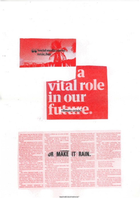
As a response to our “fake news” workshop, the above graphic was created to target the controversial environmental crisis, and draw questioning to such.
Initially, the work was created as a basic collage, which was later scanned and printed to overlaying the original. This heightened depth and allowed for a layered aesthetic to emerge. Tis effect could be utilised to heighten meaning and specific link to my subject of focus. Experimentation was undergone with specific regard to colour/ pigmentation choices, entailing for ‘inverted’ outcomes to be created. This enabled for reflection of success, and led to the ultimate decision that a predominantly red based image draws more striking and bold effect.
I then replicated such aesthetic using a riso printer, which produced a ‘neater’, sharper and bolder effect. The dot ratio function


I then replicated such aesthetic using a riso printer, which produced a ‘neater’, sharper and bolder effect. The dot ratio function also duplicated, and strengthened, the link to the news article inspiration source, which inferably heightens drama. The message here is drawn from a collaboration of individual statements, which when read together, reveal subject matter and provide sense to an otherwise, complex visual.
The utilisation of visual hierarchy is applied, sharpening audience/ viewer focus and drawing their attention to the elements of which hold greatest importance.


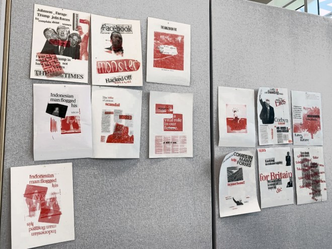
On completion of my “fake news” article, I displayed this amongst my peers outcomes, generating a sense of correlation and inclusion amongst diverse works of varying subject matters. Aesthetically, a consistent colour scheme maintained here provides the idea that each image exists to be a part of the same campaign, heightening impact.
