This workshop provided insight into the tool-sets and working methods presented by Adobe Illustrator. Specific strategies include- image tracing, brush creation, and pattern application.
In order to investigate such assets, our task for this workshop was to mock-up a company logo using masked illustration, before applying complimentary type to the image.
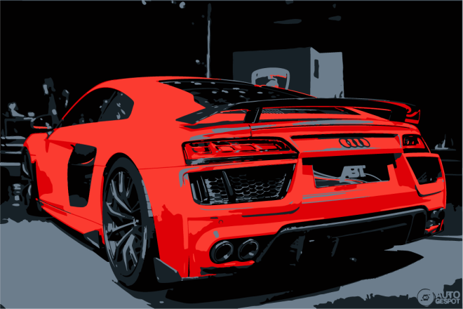
For my outcome, I subjected design around motoring and automotive design. Embedded below presents my progress working with illustrator, creating a logo design


Above, I experimented with the ‘image trace’ function, investigating the impact of reducing colours, creating block regions. I played around with the custom options, altering the tolerance as well as the amount of colours. The above image has 5 colours, implementing greater simplicity and a maintained visual. On reflection, I think this outcome looks great as a graphic, and have learnt that the image trace preset is a very easy, yet effective way of manipulating imagery.


The outcome of my logo image, I clipped the graphic into a circular composition to improve overall visual image. This also means the design can be used and replicated with more flexibility, while maintaining aesthetic harmony amongst a spread, document or any element of media.
Typographic content was selected with deliberate feature of a bold, heavy style. This ensures that it stands out amongst the background image, and is easily legible for any viewer or audience.
“Travel in Luxury, Arrive in Style” was a quote chosen to represent and translate the qualities and values of my branded company. This immediately gives the viewer ideas of expense, luxury, sporty, fast, new, flashy, status, etc.

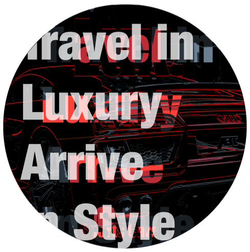
Taking my logo design a step further, I experimented with the effect of overlaying imagery and applying various layer styles. The boldness seen in the type stylisation enforced a very striking, strong visual to emerge. The outcome of this playful design work is very eye-catching and dominant on a page layout. I also used the use of vectors and clipping masks to enforce my circular composition, maintaining a consistent visual throughout the design.


My final outcomes, I utilised the style seen amongst all elements of my poster and replicated these within new typography to enforce brand identity. Composing such elements on my final poster highlights purpose, transitioning an graphic image into an advertisement, with the addition of who it is subjecting.
Overall I am satisfied with my final piece, and on review of this workshop, feel as though my skills working with Adobe Illustrator have been advanced. I now know how to use image trace, pre-set styles, how to adjust these to my preferences, how to use clipping masks and vector shapes.
