11:00 – Arrive at Walker Art Gallery
Prided on being one of the ‘finest art galleries in Europe’, Walker features an exquisite variety of artworks ranging from historic masterpieces, to contemporary breakthroughs. Embedded below are my findings where I recorded my excitement, interest and general opinions.


Dynamic, unconventional and clean-cut, the works of Sean Scully present a consistent theme of distortion. Constructed within grid form, it can be interpreted as though he were to be ‘bending the grid’, inducing a completely original aesthetic. Analytically in regards to Graphic Design, this alteration of the grid significantly changes the way in which the images are read for any viewer or audience.
Content featured frequently throughout his Walker collection included diverse variations of line, form and composition, each selected specifically to maintain atmosphere and effect. For instance, the images struck me personally as containing a depth of field, evoked by visual association with scenes from every day life. Subjects in the front sit sharper and more refined than background form, which almost merges to a blur reflecting out of focus movement.
As extremely striking images, Scully’s works were some of my favourites within the Walker Gallery. His bold use of colour, composition and form inspired my ideas of general aesthetics, and how to evoke the effect of movement through abstract, minimalist processes.
Other artworks which captivated my interests are presented below.


Above – Mirage, 1999, created by Raedecker.
Successful holder of the John Moores painting prize in 1999, Raedecker is credited with his inventive use of media, pushing the boundaries of generic techniques. Combining his love for fashion with his ability to paint, the outcome of this painting reflects a new dynamic, inflicting more real, textured attributes to an unsettling, distorted reality. Atmospheric nature is gloomy, evoking sensations of unease, achieved selectively through Raedecker’s aesthetic, compositional choices. He claims to have been “pushing the possibilities in a playful way”, experimenting with the ways in which an audience would interpret the work. For this reason, he chose to produce the image on large scale, intending on formulating a ‘masterpiece’.
")

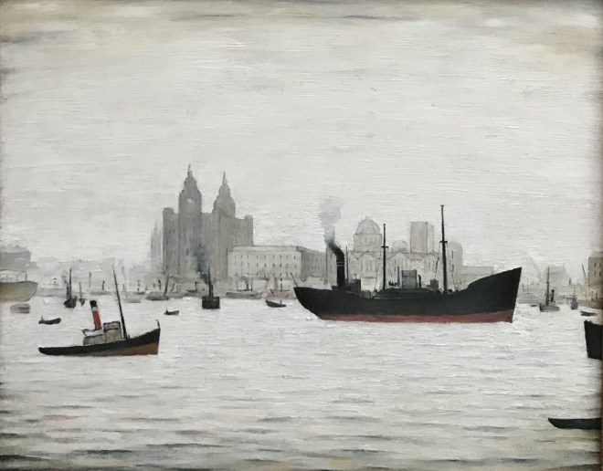
Above – The Waterloo Dock, 1962 (left) The Liver Buildings, 1950 (right) painted by Laurence Stephen Lowry.
Conveying a strong sense of place, these works portray the atmospheres and events occurring throughout Liverpool during these specific frames within time. Lowry’s stylistic choices echo emotions of solitude and desolation, achieved through his minimalistic nature. His dull, desaturated colour palette heightens this interpretation, making the landscapes appear systematic, and depressing within this sense. Aesthetically, Lowry’s work withholds well established compositions and depth of field, strengthening the work as a visual.
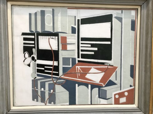
Created through oil on canvas, Telecommunications, created by Paul Nash was one of my favourite artworks at The Walker Art Gallery. Influenced by the surrealist movement, Nash intentionally subjects Telecommunications to a certain compositional distortion, evoking confusion for any audience. This outcome is particularly unconventional for Nash, where many of his works feature subjective content driven through more naturally enriched images, i.e. landscapes. However, it can be clearly noted that his use of spacial composition, shape, form, depth and colour within Telecommunications, has clear significant ties to his better-known, conventional way of working.
‘Nash created Telecommunications for a local post office, advertising their new automatic telephone exchange. Nash has simplified the completed machine. He has reduced it to geometric shapes and used only a few colours.’ Walker Art Gallery. The work signifies Nash’s ability to be flexible and adapt to new changes; his work undertook a new dynamic with an extremely differential stylistic nature, where the content featured provided reflects early progress within our new technologic world.


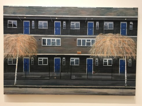
Above, Red Road, 2016, Graham Martin.
Created through use of acrylic on canvas, Martin’s work portrays his interests surrounding architecture within the built environment. He ‘draws inspiration from the ageing estates and urban developments occupying forgotten spaces on the fringes of the city’, therefore inflicting associations of solitude, isolation and decay. Portrayal of his subject is presented to be dull, drowned out and dated, hence inferring such strong negative atmosphere.
‘He is interested in the dialogue between drawing and painting and the interplay between working ,meticulously and applying paint more freely… working in this manner is driven by an ingrained attention to detail and certain obsessive tendencies and allows him to explore the properties of paint’.
source: graham-martin.co.uk/about/

“My preoccupations with mixed media, personal history, and calculated colour, keep the work open, drawing the audience into a peripheral world of imperfect geometries.” Laurence Noga.
Noga produces work through layering strips of found papers and shapes with imperfect geometric regions of colour, immersing the viewer. Materials include acrylic, collage and varnish. Deep Blue Filtered Silver is particularly intriguing due how it is constructed. Producing the work onto an obscurely shaped piece of wood makes it stand out above similar works – produced on paper or canvas. The individuality of the medium and the uniqueness possessed within the work drove a certain fondness, mesmerised by its aesthetic qualities. Another favourite at Walker Art Gallery.
source: singulart.com/en/artist/laurence-noga-529

The Space Between Revisited, 2016, Ben Johnson
Constructed through the use of frames and grids, this image by Johnson possesses strong geographical and structured assets. Visually breath-taking, the painting presents a multi-dimensional reality, layered and reflected through his constructed spacial boundaries. Colours have been selected specifically to form a washed out colour palette, inducing subtle atmosphere without detracting attention from his interlacing gridded system. These colours have then been desaturated and brightened in background sections, playing on our human association of depth of field – inducing even deeper dimensional reflection and replication within this outcome.


Mother, 2016, Frances Aviva Blane
Saturated with bold expression, Mother by Francis Aviva Blane denotes strong emotive values constructed through her use of semi-abstract mark-making.
Her ability to use mediums in a way that is so heavily influenced by her personal thoughts, feelings and perspectives particularly caught my attention. The nature of Mother’s stylistic qualities provide insight into to that of modern society and how its shared values present themselves. With no right or wrong, and a generation so desperate to create image, Mother portrays desperation combined with frustration, where medium and message combine to create a deeper sense of meaning.
No Ball Games, 2017, Liz Bailey
“In my work I question and visualize the overlapping borders between nature and culture, memory and forgetting, private and public. I make paintings of structures where natural forms co-exist within the urban landscape and also interrogate instances of man’s intervention within the rural landscape.” Liz Bailey
Liz’s style refines elements to their most basic, simplistic qualities, enabling for easy analysation of the scene for any audience. This ensures the painting is read for the atmospheric values within the scene, where such contrast as mentioned above can be easily noticed. Much of her work subtly reveals our complicated relationship with nature.
“My depiction of trees in many works are used as metaphores for other issues such as ‘silent witnesses’ to events, as memorials, implying political and environmental issues and as a metaphore for the self or national identity. I use the ‘tree’ as an archetypal symbol of landscape painting and as a motif to help convey my ideas about the world around me.” Liz Bailey.
source: http://www.lizbailey.org.uk/
http://www.lizbailey.org.uk/statement.htm


Black Star, 2017, Virginia Verran
“The paintings exist on a ground between potentially recognisable image and paint as an independent, physical force… Where the paintings suggest a possible sense of the body (internal and external) and flesh and atmospheric space the drawings suggest layers and planes of space impacting on each other; mappings, geographic urban demarcations, pools, symbols, flags, shadows, cooling towers; fears both physical and psychological hover over peaceful vistas.”
Elements within Black Star provided a strong sense of place, sought predominantly through Verran’s personal experiences, reflected within her choice of content, placement and general stylistic aesthetic. Strong contrast obtained here subtly reflects true diversity maintained throughout society, where acceptance is spread much further afield in our modern, subjective generation. Black Star documents such advancement in creative perception with more recent artistic movements.
Source: https://www.axisweb.org/p/virginiaverran/#info
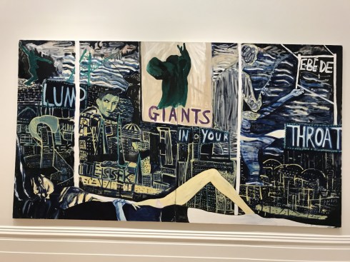
Giants, 2017, Joseph O’Rourke
Based on subject matter and content, Giants by Joseph O’Rourke is constructed through implementation of social constricts, emotive qualities and relatable aspects of modern society.
The painting was created following a recent visit to Budapest, where O’Rourke lived for 6 months. He revealed the city seemed ‘giant’, inferring the feeling of being lost and feeling small, a feeling a majority of people could relate too. This concept is captured perfectly within Giants, where O’Rourke made certain aesthetic choices to ensure of such emotive portrayal. This includes- composition, lighting, mark-making, tone, shade, highlight, typography, negative space, etc, which were deliberately chosen to create an overwhelming atmosphere, yet sombre mood.
Source: http://www.liverpoolmuseums.org.uk/walker/johnmoores/jm2018/prize-winners/o-rourke.aspx


Doubt and distance… of lost content, 2017, Pete Clarke
Conventional amongst Pete Clarke’s works, Doubt and distance… of lost content is internally narrated through use of bold, strong typography. This type subtly narrates meaning and message, implying mood and atmosphere to any audience, providing the image with inferable emotive values.
This particular image presents a sense of “the changing nature of the city and the notion of the everlasting uncertainty of things that get knocked down and re-built.” Pete Clarke.
…”I’ve always been fascinated by the notion that art has a text – whether we look at paintings or whether we read them. The different languages dislocate each other so you have to reread the paintings. The words fragment the narrative.”
